-
Modern: Visual Noise

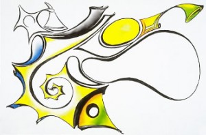
Visual noise is great when my goal is a loud and emotional piece. It can easily be created by playing different design elements off each other. A few examples of contrasting elements in this piece are; thick and thin lines, sharp and soft edges, positive and negative space, repetitive patterns and random lack of order, and contrasting colors. The more I contrast between these elements the more noise I create. However, if I contrast consistently and evenly through out my work, it will negate any noise while leaving texture, movement, and emotion from the contrasting.
Rembrandt Van Rign was known for playing warm and cool tones off each other. In such a subtle and consistent way, that would keep visual noise at bay, leaving behind subtle moment and emotion in every piece.
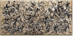
While, on the opposite end of the spectrum you have Jackson Pollock. There is nothing subtle in any piece he has created. In Pollock’s work below, there is so much consistent visual noise, that it becomes a pattern of redundant randomness, and there is very little that is unexpected. However, this piece is very large. Up close it gives me motion sickness, and suddenly I feel like I have the ability to create my very own Pollock. To say his work is not my favorite, would be an understatement. At the same time, his work is a great example of extreme visual nose.

Leave a Reply
Categories
Recent Posts
Tags
Acrylic
Color
Color Psychology
Composition
Constitution
Design
Dr. Martens
Drawing
Fabric
Freedom
Furniture
Graphic Design
Illustration Board
Impressionism
Ink
Interior Design
Kids
Linnear Persoective
monochromatic
Multi Medium
Oil Pastels
Optical Center
Paint
Party
Pen
Pencil
photorealism
Portrait
Prisma
Pro Life
Secondary Tertiary Colors
Shades
Site Skin
Sketch
Spray Paint
Sunflower
Texture
Tints
Tones
Visual Balance
Visual Direction
Visual Weight
Wall Color
Wall Paint
Wax Pencil
