-
Sunflower: Visual Noise With Secondary Tertiary Colors


 I absolutely love sunflowers. They are simply a big, bright, beautiful, happy flower. I love the Fibonacci design in the florets, which i didn’t even attempt to duplicate with this quick oil pastel project.
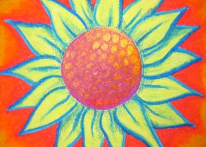
It took about 30min. I wanted to see how happy, bright, and contrasting i could get with secondary tertiary colors, without creating too much visual noise. It’s a very loud piece, however the warmth of the burnt orange and soft yellow bring it down just enough to keep the happy vibe i was going for. Oil pastels are a quick way to work with different color pallets. They are also great for planning out a design and build much more quickly than wax pencils. There’s a literal fine line between tertiary colors and neutral colors. They will always turn a mucky neutral brown when mixed, which is great when you want to use color to build brown neutral colors. With how messy oil pastels can be it was hard to keep the deep blue edge from touching the burnt orange. Sometimes it’s nice to just complete something. Projects that take weeks or months have amazing rewards as well. This time around I just had fun.
– Krystal Marie

Leave a Reply
Categories
Recent Posts
Tags
Acrylic
Color
Color Psychology
Composition
Constitution
Design
Dr. Martens
Drawing
Fabric
Freedom
Furniture
Graphic Design
Illustration Board
Impressionism
Ink
Interior Design
Kids
Linnear Persoective
monochromatic
Multi Medium
Oil Pastels
Optical Center
Paint
Party
Pen
Pencil
photorealism
Portrait
Prisma
Pro Life
Secondary Tertiary Colors
Shades
Site Skin
Sketch
Spray Paint
Sunflower
Texture
Tints
Tones
Visual Balance
Visual Direction
Visual Weight
Wall Color
Wall Paint
Wax Pencil